Colour me bad!
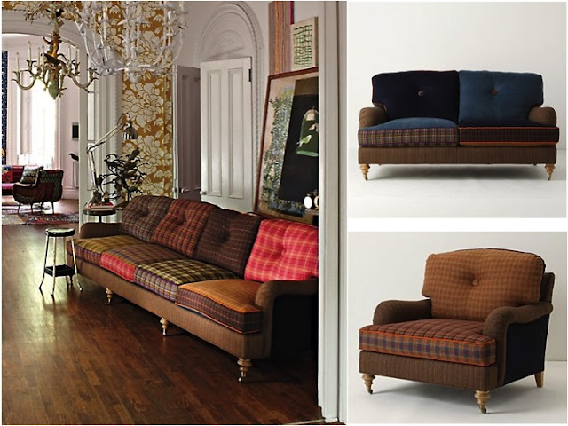
I've been looking to reupholster my couch. It's quite an eyeful when it comes to colour with large fuchsia, orange and gold prints on a rust base. I do love it but in the new house I was meaning to redress it into something more sober. Yeah, can you believe it, me choosing sober over colour?! And then I come across Anthropologie and all resolve to stay sober flew out of the window. Take a look at these and you'll know why.
I am a big fan of using unconventional fabrics and prints for upholstering and this fits right in. The combination of different checks in different colours just lifts this couch out of what could have been just comfy and boring to kitschy and fun. I would love to have something like this in my study!
Here's another example in our very own Ikat. Did you know that Ikat is actually an Indonesian word and that this weave is found in many other cultures besides our own, including Japan, South East Asia, Central and South America and even parts of Europe?! Well, I just love the use of it on these chairs and that blue sofa. The richness of the colour and the fabulous Ikat motifs can make any piece of furniture an eye catcher!
So the next time you're thinking of upholstering, why not go for the bold and the colourful instead of the usual plain and pastel!
*All photographs taken from Anthropologie


Your blog is lovely!! rather gorgeous!! I'm so pleased to have found you!!
ReplyDeleteI love seeing images of coloured couches.. but when it comes to bringing them home... I like plain coloured.. *smiles*.. coz I like colours around it... :-)
Anthropologie is fabulous in its creativity and merchandising. Love the pattern mixes - its different.
ReplyDelete